How can you make sure your new auto dealership website works smarter so your dealership gains an edge on the competition?
Rather than stressing your customers with a web experience saturated with graphics, animation, pop ups, flyouts, and forms, it’s better to take a less-is-more approach to web design and UX, which is why the dealership websites designed by CarCasm look and work the way they do. Here’s your peek behind the curtain, outlining a few simple design principles that’ll get you great mileage.
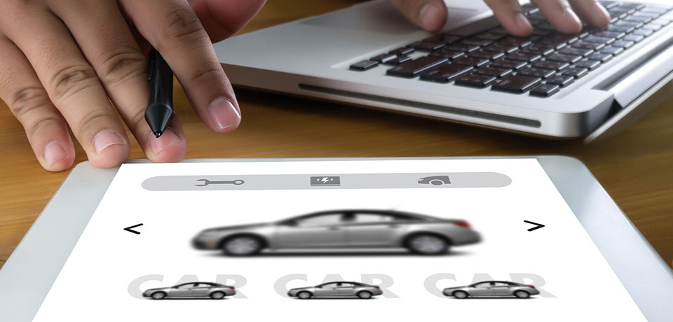
Less Really is More
If you’re a dealership for a single brand (say, Audi) or brand family (Chevy GMC Buick or Chrysler Dodge Jeep RAM, for instance), odds are better than even that you’ve got a series of brand guidelines that encompass everything from acceptable verbiage to colorways and fonts. But what if you’re an independent dealership?
- Use a limited color palette: Your website should use three to five colors at most.
- Stick to a single font family: One or two fonts (one for body text, one for headers and accents) works better than a profusion of different typefaces; stick to sans-serif fonts for accessibility and ease of reading.
- Limit your graphics: Your logo or a hero image for your latest promotion is a good thing, and photos of your inventory are a must; anything else is just a distraction.
Remove Friction Points
You’re running a 25 percent off special on oil changes, or a free fourth tire if someone buys three. And you’d like to grow your mailing list. And encourage downloads of your new app. And allow notifications for price changes. But ask yourself: are you in the business of collecting email addresses, or selling cars? The more choices you put between your customer and their buying decision, the more likely they are to click to a competitor’s website.
Don’t Reinvent the Wheel
Much like a car or a pickup truck, we expect a dealership website to look a certain way and do certain things. Nobody would expect to find the steering wheel in the back seat, or to have to pop the trunk to change the radio station, but some dealership websites require mental gymnastics to get around. That’ll hurt your business.
- Keep navigation simple: Keep key pages linked via top navigation, and don’t ditch the hamburger button.
- Maintain accessibility: Keep your website mobile-friendly and people-friendly.
- Pay attention to UX and SEO: User experience (UX) and search engine optimization (SEO) go hand-in-hand, and a user-friendly site will rank higher.
Remember to Focus on the Customers
Countless dealerships have approached CarCasm for help getting their dealer sites up and running, or to get more out of the web presence they’ve spent years trying to build up. Because of that, we’ve learned a thing or two about the industry. We know the pride you take in your work, the effort you put into keeping your customers happy, and — perhaps most of all — the challenges of setting yourselves apart from your competitors.
With that being said, your site, like your dealership itself, isn’t really about you. It’s not about your dealership, your sales staff, your techs, your service writers, or the folks behind the parts counter. They’re all important, but without customers, they wouldn’t have much reason to be there. We’ll take care of the design fundamentals so your website, like your dealership, is one that people will want to come back to!
Our promise as developers is to put quality work into every project while delivering professional expertise and most importantly exceptional customer service.
Need More Information...
Recent Posts
- How CarFax Benefits Your Car Dealership
- Do You Need Dealership Inventory Management?
- Less is More: Designing an Auto Dealer Website
- Embracing Simplicity: The Coming Commonality Of the Virtual Deal
- Does Live Chat Help on Car Dealership Websites?
- Strategizing Successfully and Navigating a New Normal
- How To Communicate Your Needs to a Web Designer
- CarCasm Websites
- Converting Your Calls With Inbound Call Tracking
- Showcasing Holiday Promos for Your Car Dealership